
How to design an app you're proud of (without hiring a designer)
Step 2 of 6. You don't need design skills. You need taste, a few decisions, and a clear screen list.

You’ve validated your idea. Someone out there wants what you’re building. And now the next fear shows up:
What if the app looks embarrassing?
I know that feeling. When I was about to hand my screen sketches to the agents building Ocho, I kept second-guessing myself. Who am I to make design decisions? I’m not a designer. What if it looks amateur?
Here’s what I didn’t understand then: a clean, professional-looking app is not the product of design talent. It is the product of a few clear decisions made in the right order. Taste is learnable. And the decisions are smaller than you think.
You do not need to hire a designer. You need to know your three screens, pick a direction, and get out of your own way.
Where this sits in the whole journey
One step at a time:
Validate - is the idea worth building? (done)
Design - make something you’re proud of, without a designer (you are here)
Build - ship it with AI agents directing the code
Ship - get it on the App Store
Money - get people to actually pay
Growth - your first 1,000 users
Design is step two because you cannot build something you haven’t decided on. But design doesn’t mean Figma files and a mood board. It means: what are the screens, what does each one do, and what does the whole thing feel like? Those three questions are the whole job.
Taste is a decision, not a talent
Every great-looking app you admire was made by a designer who made one decision first: what is the single strongest thing this app should feel like?
Calm. Playful. Serious. Minimal. Satisfying. That is not a skill. It is a choice.
When I designed Ocho, my weekly-goals app, I made one decision: radical simplicity. Every goal app I’d looked at felt like a second job. Menus inside menus, streaks, points, settings for settings. The one-star reviews were full of “too complicated.” So Ocho’s design direction was the opposite of all of that. One screen. Three goals. Nothing else visible. Every design decision after that was easy: if it made the app more complicated, it was out.
That’s not a designer’s intuition. That’s reading the complaints from Episode 1 and picking a lane.
For Banded, my IELTS vocabulary app, the design wedge was cleaner than Anki. Anki has the power of a cockpit and the warmth of a tax form. So Banded’s direction was: looks like something a human made, not a university database. Import your words on screen one, study on screen two. Done.
Both apps have clear directions because the research gave them to me. Your validation work from Episode 1 did the same thing for you. The most repeated complaint in your competitor reviews is your design direction, in disguise.
The three screens every consumer app needs first
You do not need to design the whole app. You need to design three screens, in this order:
The first thing they see - this is your opening screen: the moment the app loads and the user hasn’t done anything yet. It should show one action, not five. If there’s nothing to show yet (they haven’t created any data), it should tell them the one thing to do. No overwhelming grids of empty boxes. One prompt.
The moment the app works - this is the core loop: the screen where the thing the user came for actually happens. For Ocho that’s the weekly view, three goals on a clean white field. For Banded that’s the flashcard screen, one word at a time. This is the screen that decides whether someone keeps the app or deletes it.
The settings / account screen - nobody talks about this one, but it matters. If a user can’t find their subscription or can’t figure out how to log out, they leave a bad review. Keep it a plain list: account, subscription, feedback, sign out. Four items is enough.
If those three screens are clear and clean, the rest of the app follows from them.
What “clean” actually means (it isn’t minimalism)
I used to think clean meant sparse. White space everywhere, no color, no decoration. But some of the apps I admire most are warm and textured. Clean isn’t the amount of stuff. It is the consistency of decisions.
Four things make an app look professional:
One font, two weights - pick a readable font, use one bold weight for headlines and one regular weight for body. That’s it. You don’t need to be a typographer.
One accent color - the color that marks the important action on every screen. Not five colors, one. It should feel like the app’s personality. For Ocho that’s a warm amber. For Banded it’s a clean slate blue. One color used consistently reads as intentional. Six colors used randomly reads as rushed.
Same corner radius everywhere - the roundness of your buttons, your cards, your input fields. Pick one radius (try 12px or 16px as a starting point) and use it everywhere. Inconsistent rounding is the single most common reason apps look “off” without anyone knowing why.
Breathing room - the space between elements. Non-designers default to cramming things together to fit more on screen. It always looks worse. Give each element more space than you think it needs. If something feels too empty, it usually looks better than you fear.
Those four decisions are not design talent. They are design constraints. Constraints make things look professional. Unlimited options make things look chaotic.
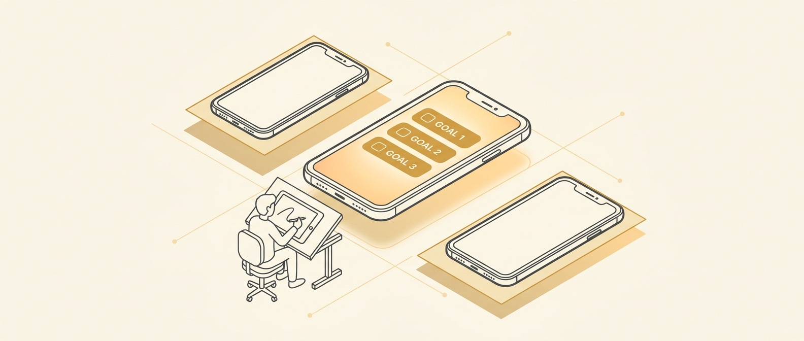
A mini-example: the first screen of Ocho
Before I had a single pixel designed, I wrote this out on paper:
“The first screen shows the current week. Three blank slots. A small text that says ‘pick your three things for this week.’ A button that says ‘add a goal.’ That’s it.”
No navigation bar. No tutorial. No pop-up. One thing to do.
The agent building the app turned that paragraph into a screen. I gave feedback: “make the slots bigger, there’s too much padding between the week header and the slots, change the button to amber.” Three rounds of feedback and it looked like I’d meant it from the start.
That is the design process for a non-technical founder. You describe the screen, the agents build it, you react to what you see. The deciding is the job.
That process, screen by screen and decision by decision, is what the full Screen-by-Screen Design Playbook below covers.
